Overview
DOLBY · REBRAND
Dolby
Rebrand · Brand Design
This new Brand ID articulates how the Dolby brand shows up in a new consumer space.
I re-envisioned the Dolby consumer brand to set the foundation for Dolby's consumer products launching into the market. The current brand felt cold and detached from consumers; it lacked emotion and felt too corporate.
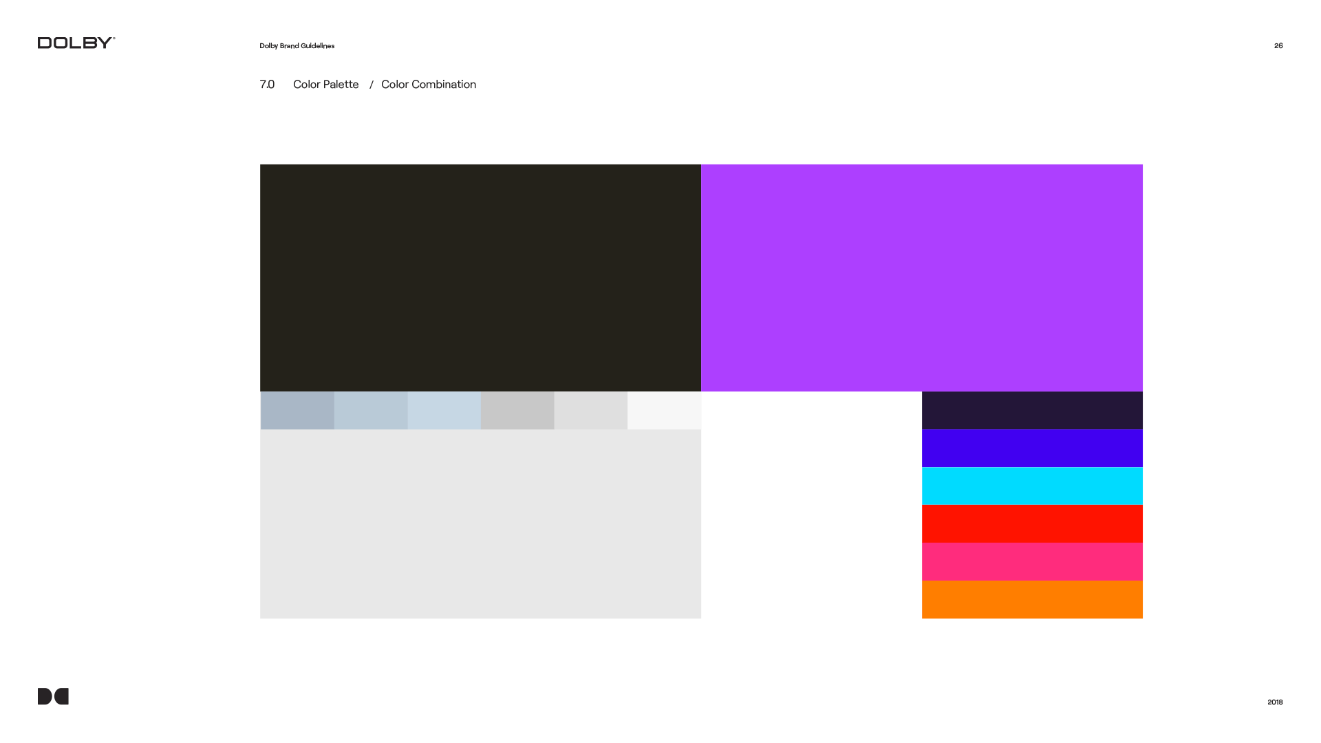
My main goal for this redesign was to open the brand up and make it fun and appealing to new audiences. I pushed to give the brand a new color palette. Bright, bold colors are what is needed. The world has too many technology brands in the black and white color space. The world needs color!
Identity
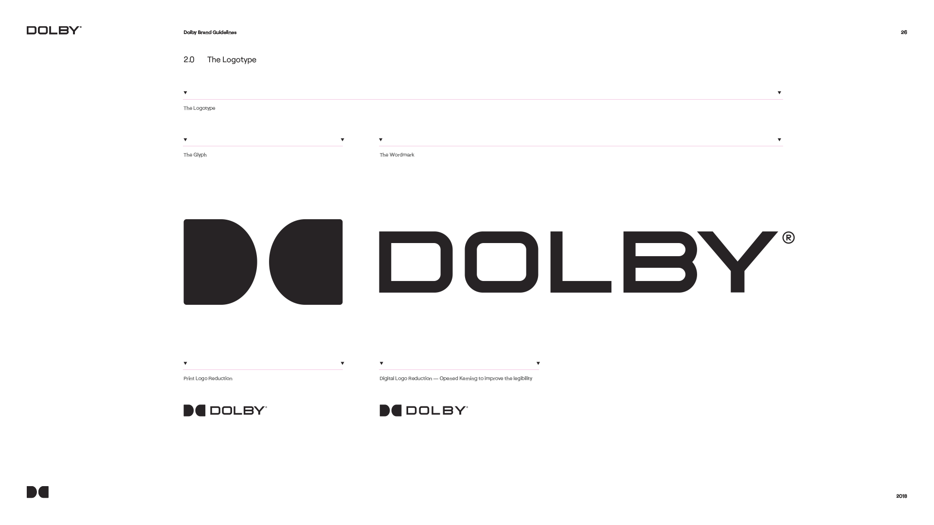
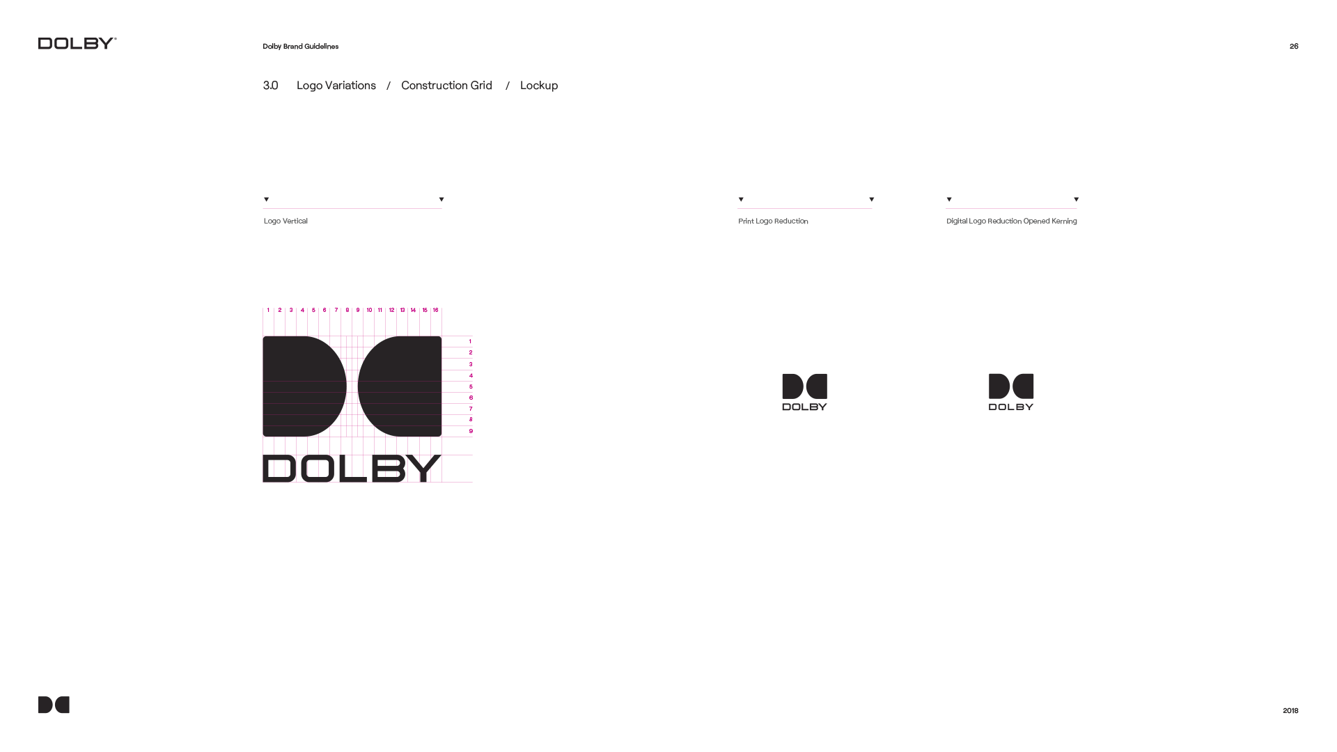
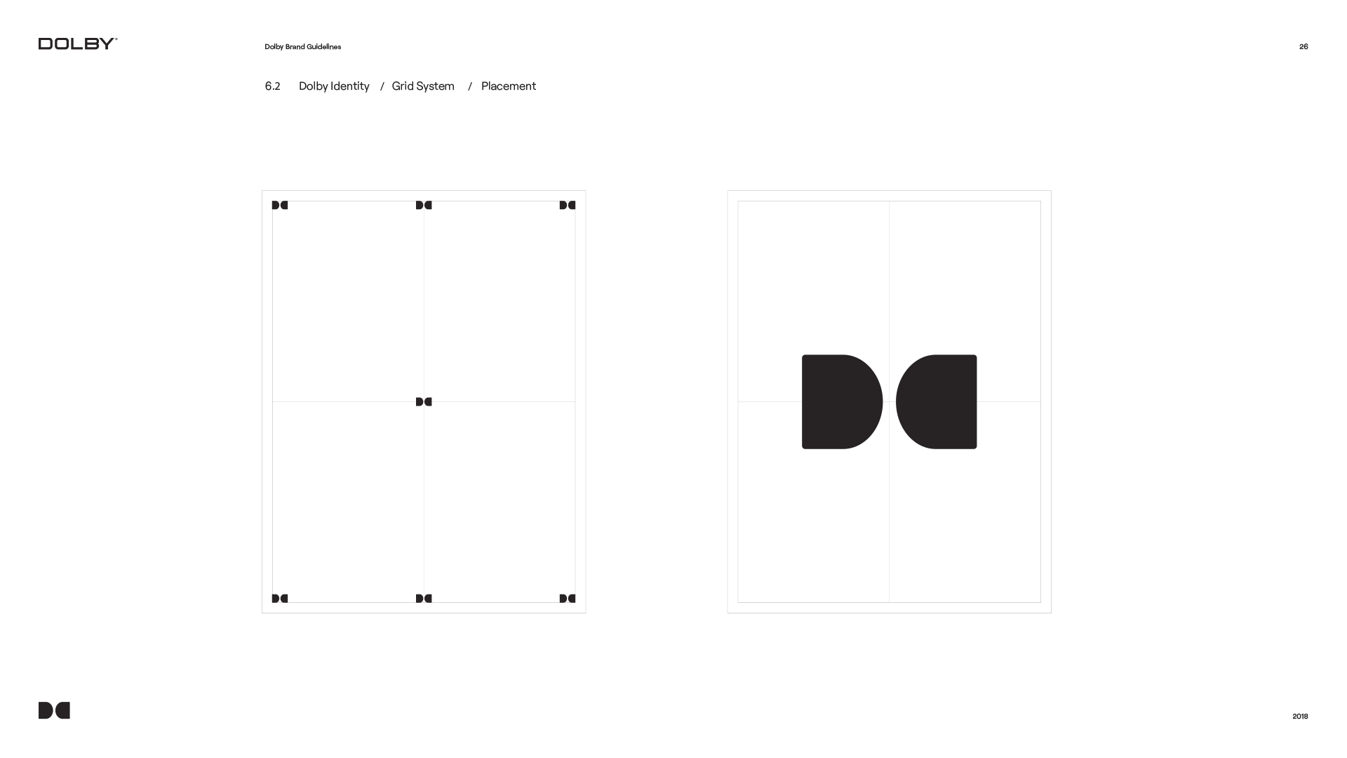
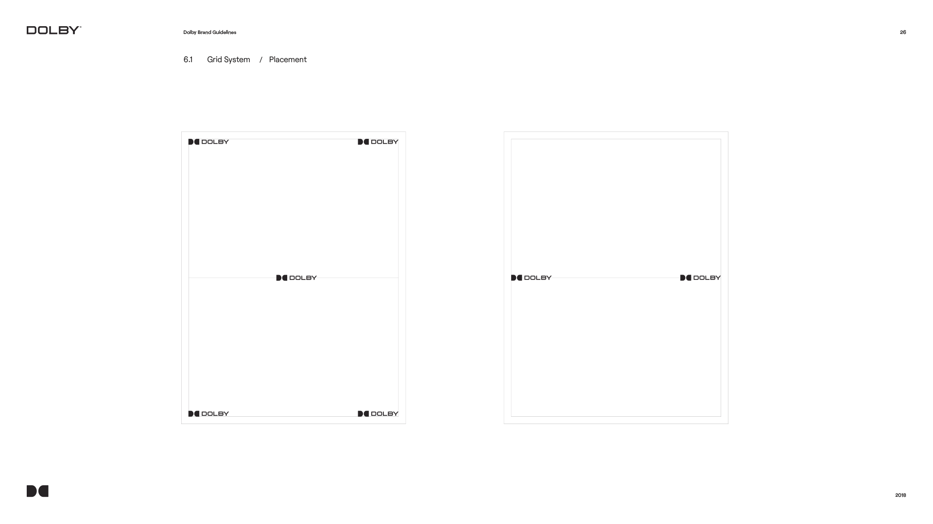
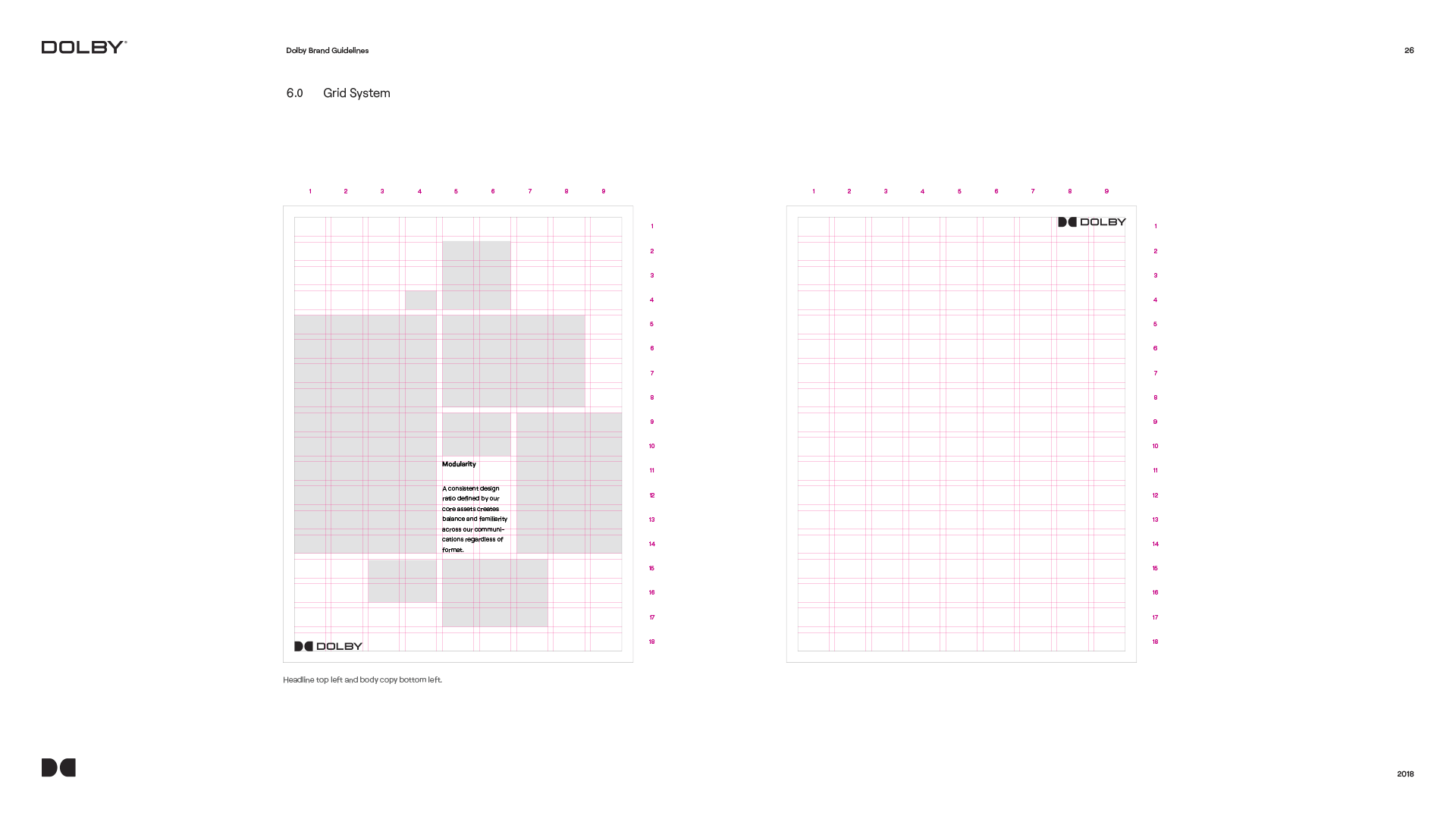
The double D
From an enclosed mark to an open window into Dolby content.
The driving insight behind the Dolby logo evolution stems from its origins. When Dolby was founded in 1965, television screens were square, and the logo design reflected that era. However, in today's world, nearly all screens are widescreen.
To modernize the brand identity, we reimagined the logo to align with contemporary screen formats by subtly stretching it. We also removed the enclosing box. This transformed the iconic double “D” symbol into a window into the world of Dolby content and symbolized breaking down silos and fostering deeper collaboration across teams.
Color
Color strategy
Make Dolby visible in a category defined by black, white, and muted tones.
To ensure Dolby's brand identity stood out in the marketplace, we conducted a competitive landscape audit of color usage across key industry players, including Sonos, Bose, Apple, Analog Devices, and IMAX. The analysis revealed a prevalent use of black, white, and muted tones among competitors, reinforcing a sense of uniformity within the industry.
Recognizing this, we saw an opportunity for Dolby to break through and establish a more distinctive presence. By embracing bold, vibrant colors, we positioned Dolby as a brand that commands attention while reinforcing its core offering, Dolby Vision. Rich, dynamic hues differentiate Dolby while reflecting the brand's commitment to vivid, immersive experiences.
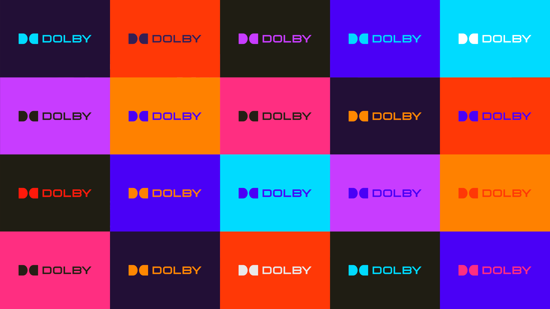
This bold approach to color keeps Dolby visually and technologically at the forefront of innovation.
Applications
Layouts applied
Pressure-testing the identity in high-visibility, real-world formats.
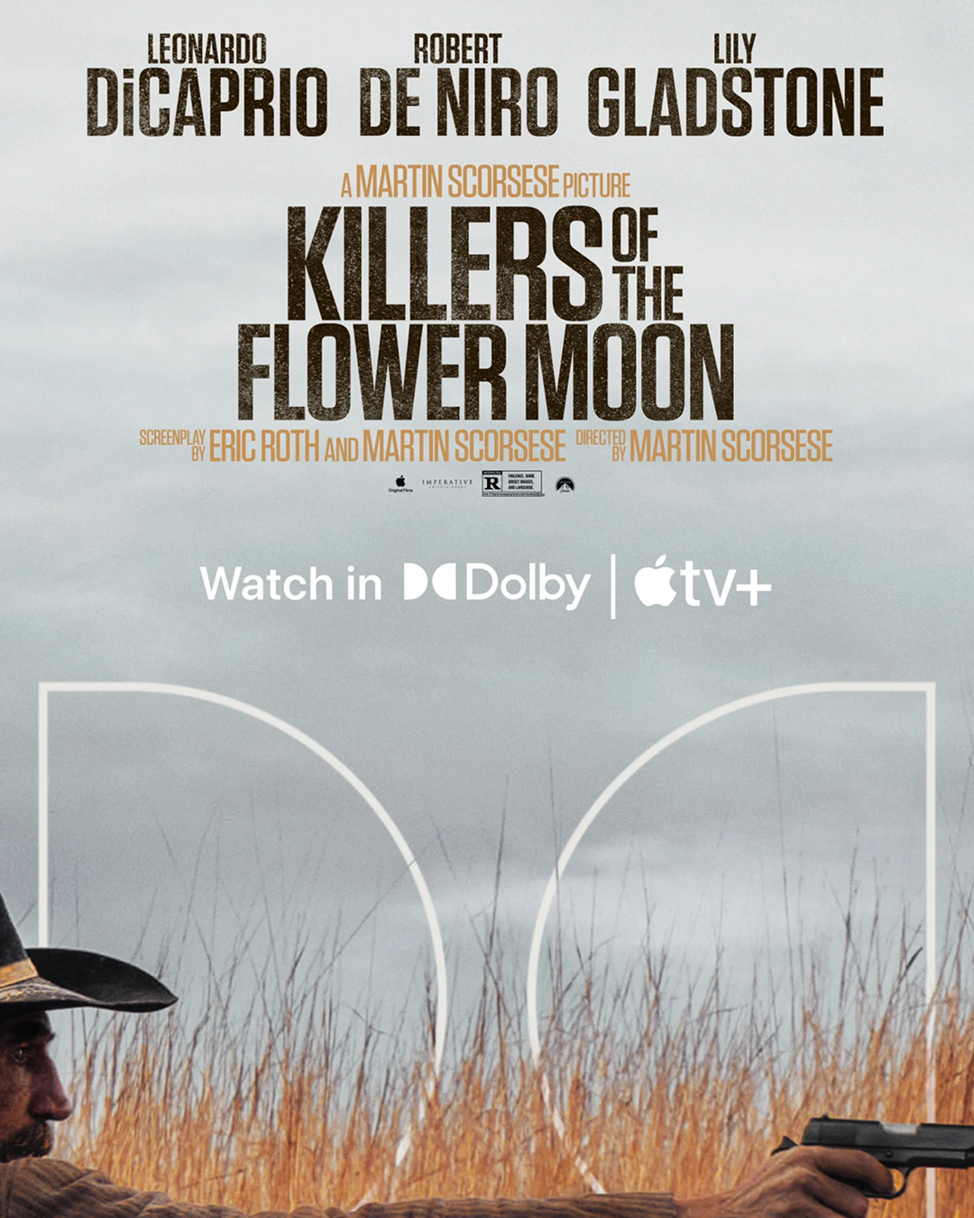
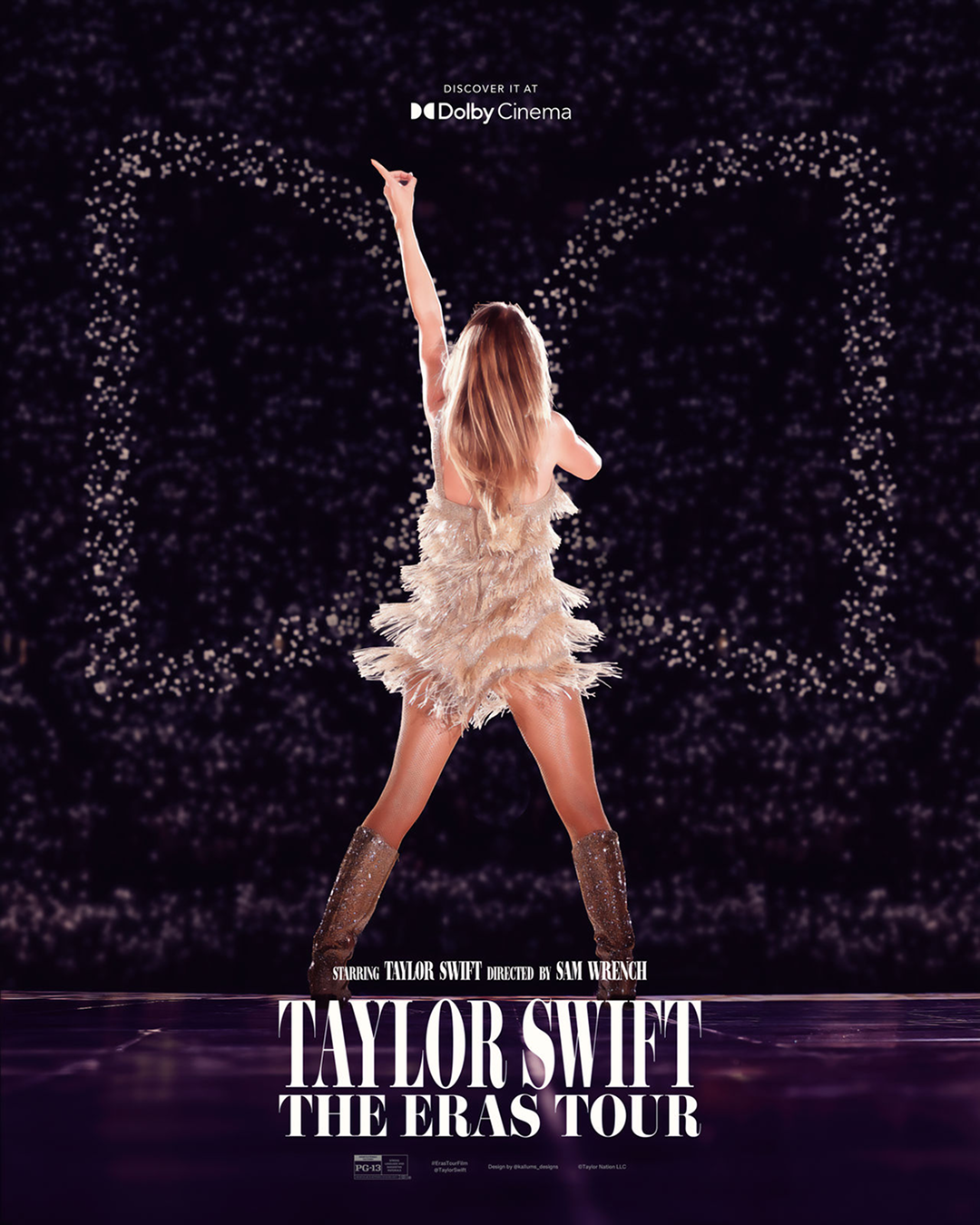
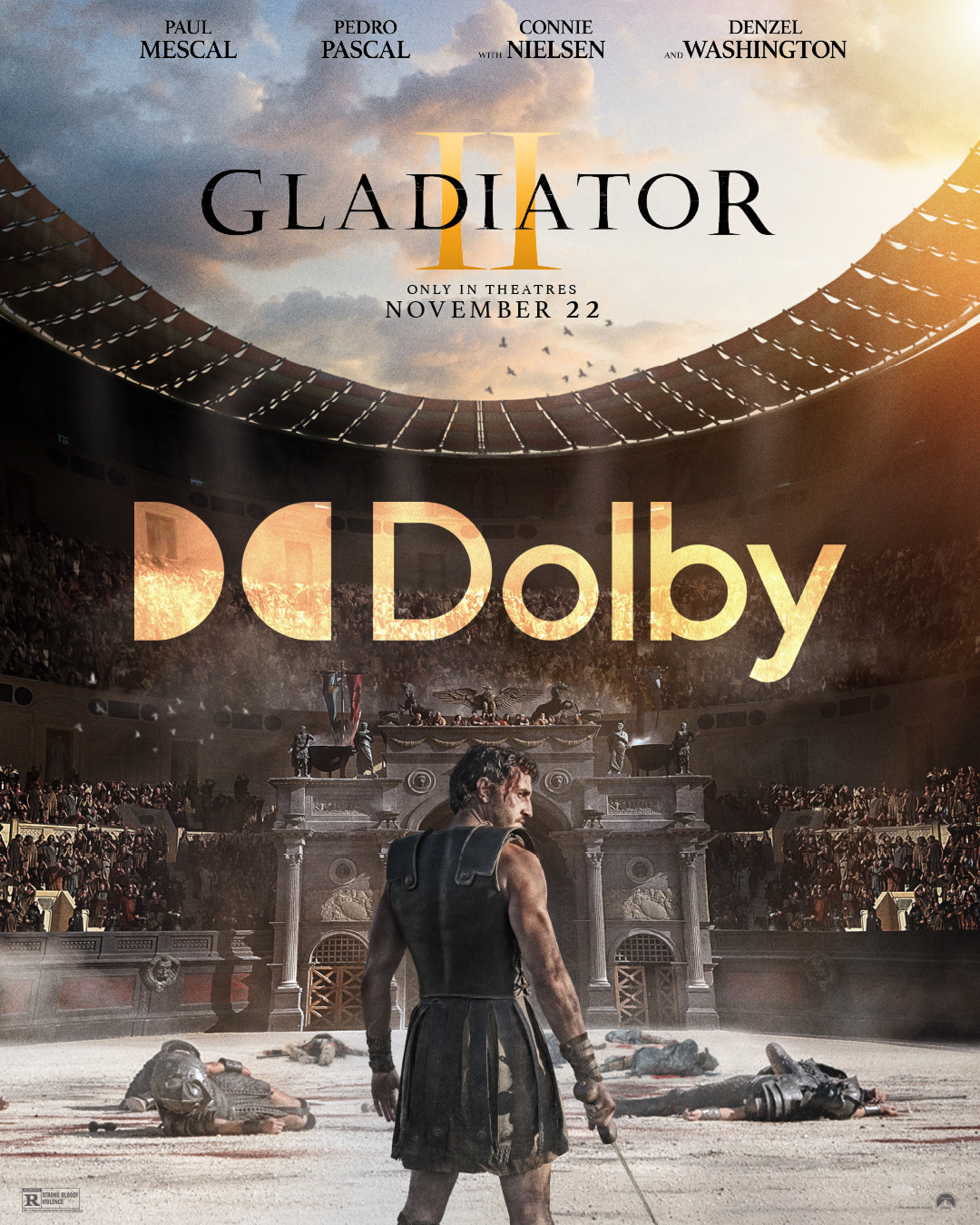
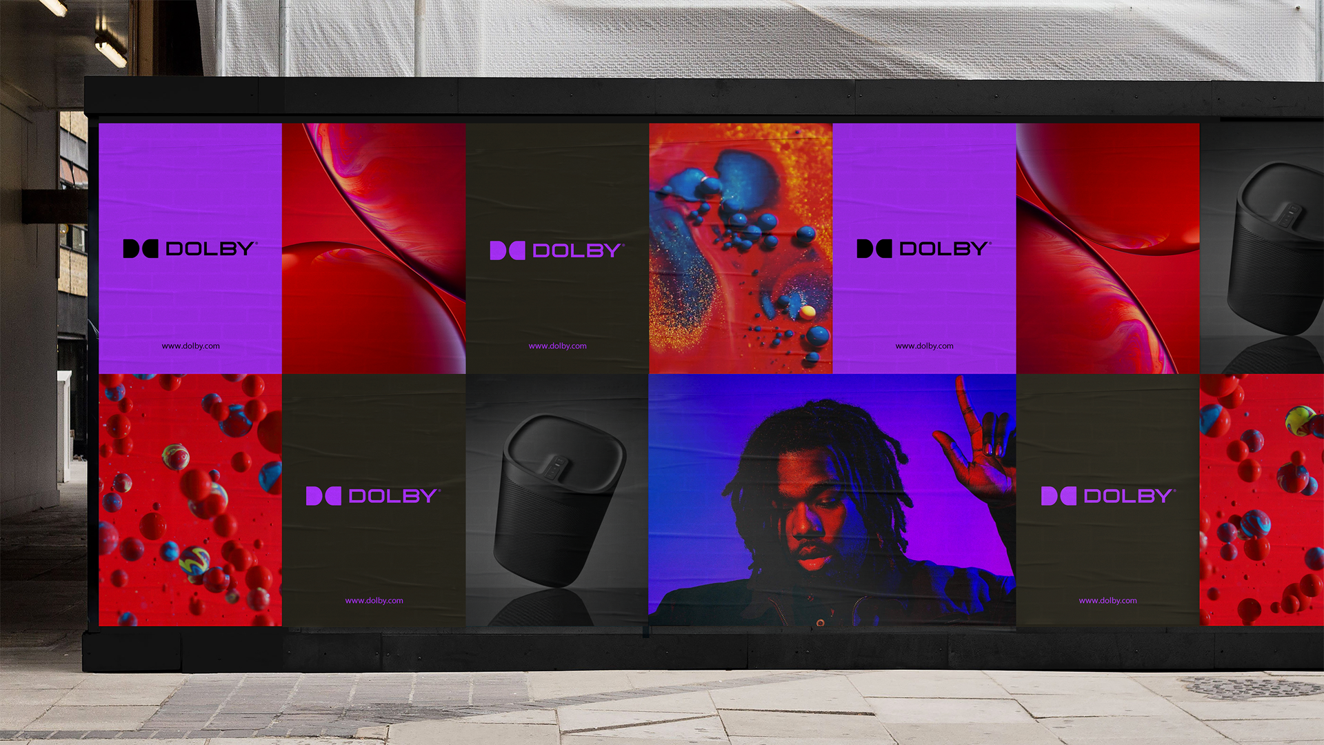
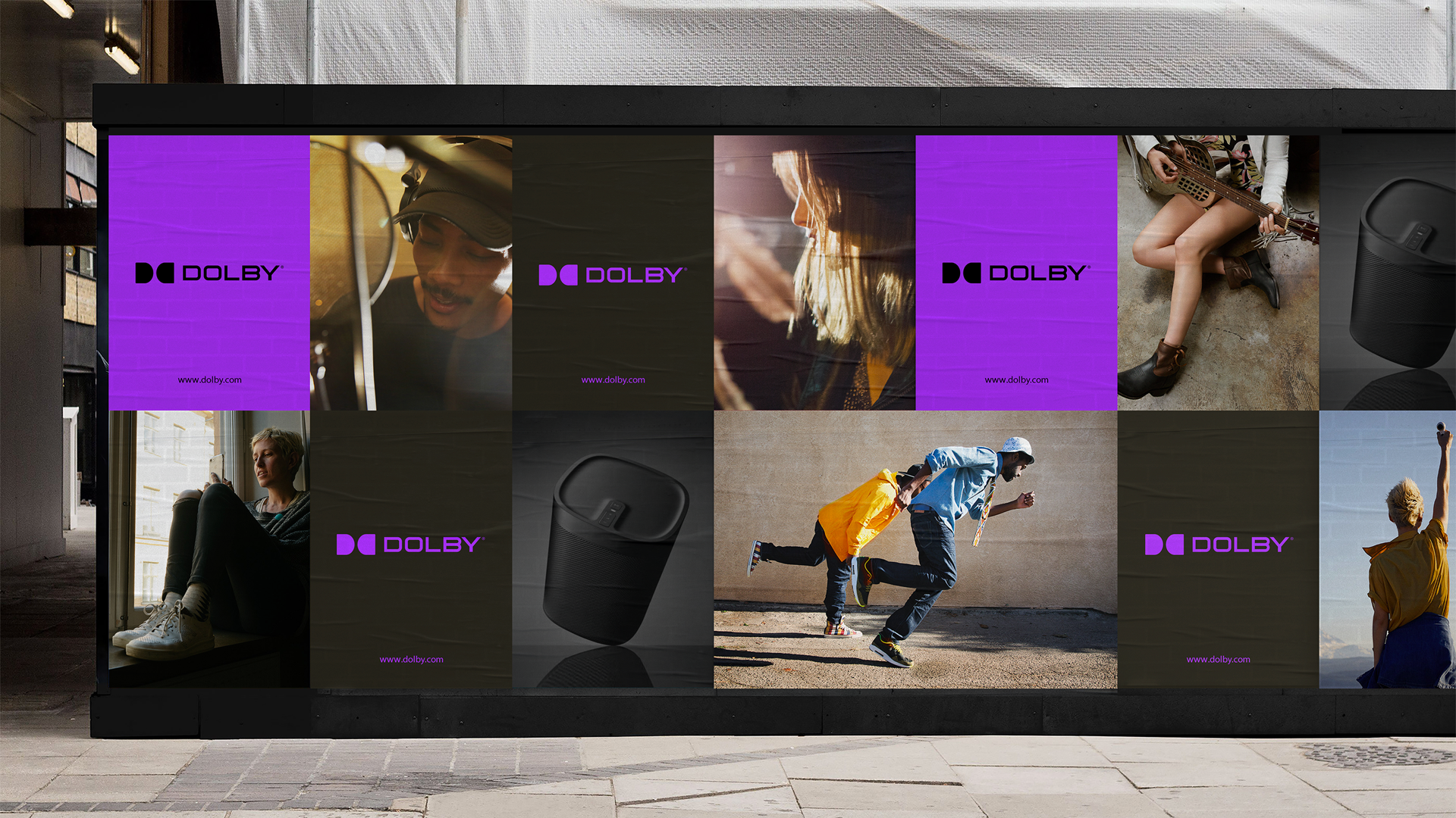
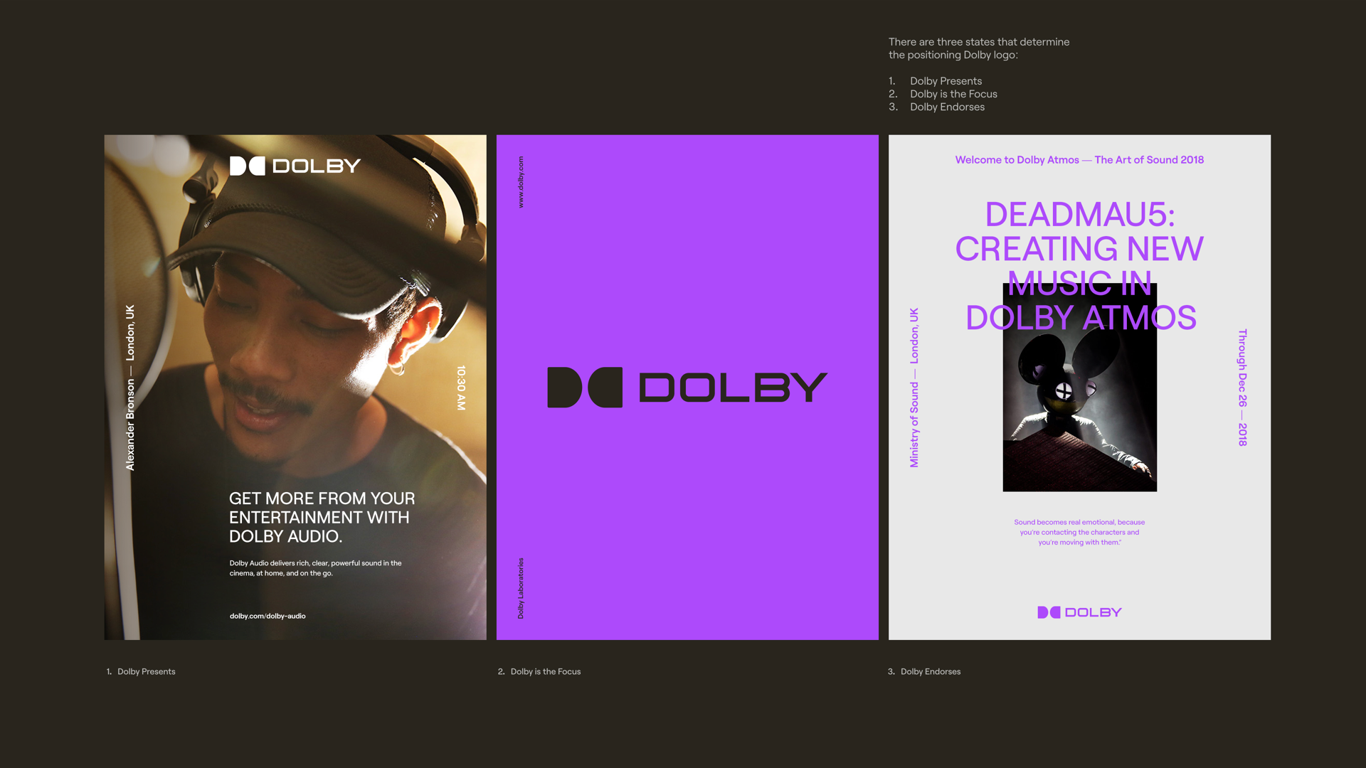
As part of the design system validation, we explored how the new identity translates across different real-world applications, including outdoor billboards and print.
These layouts test the interaction of bold colors, imagery, and typography in high-visibility environments, ensuring the visual language remains impactful and adaptable. This phase was crucial in refining and optimizing the design elements for real-world execution.
Interaction
Interaction and visual testing
Let color, motion, and the double D work as one immersive system.
Below are some early explorations of interaction patterns and visual dynamics, testing how bold colors and motion could seamlessly integrate while maintaining the double Ds as a portal into the world of Dolby content.
These studies helped refine the synergy between interactivity and brand identity, ensuring a cohesive and immersive user experience, and would set the foundation for Dolby.com.
Final system
Bringing it all together
Respect the past while opening a more expressive future.
Through the design process, we sought to evolve the Dolby identity while staying true to its heritage. This subtle yet meaningful evolution modernized the brand while reinforcing the idea of Dolby as an open window into immersive experiences.
The final design solution respects the past while embracing the future, embodying a brand that continues to innovate and inspire. Below is a look at how this concept evolved into the final design that now exists in the marketplace today.